AI From the Very Beginning: Integrating AI Perspectives into an Intro UX Course
This is the Part 2 of a post on teaching HCI Design x AI. If you’re interested in reflections about the remote nature of the course, check out Part 1.
Navigating AI as a design material is critical to the future of user experience (UX). Yet today, many students of UX leave universities without much knowledge of the potentials — and pitfalls — of AI technologies. As a result, they can struggle to communicate with data scientists and engineers, leading to losses of efficiency, potential design solutions, and user understanding.
This past summer Matt Law, Mahima Rao and I taught INFO 3450 Intro HCI Design x AI at Cornell University, a 6-week, intro UX methods course which sought to integrate AI concepts and perspectives. We asked: How can we teach about AI as a design material from the very beginning of students’ UX journey? How can we get students to understand AI not as something separate from “traditional” UX, but integral to their core practice? And how we might incorporate an AI perspective without losing teaching time to the fundamentals (e.g., usability and contextual interviews)? In this post, we share five key decisions we made in order to help others looking to incorporate an AI perspective into intro UX courses or workshops.
Background
To understand our approach, we take a quick detour to explain the broad structure of Cornell’s course on UX design, which is developed and taught by Professor Gilly Leshed. The course is structured around a major group project that where students follow the human-centered design (HCD) process from early stage research (contextual interviews), to ideation and design (sketching, storyboarding, paper prototypes), to mid-fidelity prototyping with Figma, and finally to usability testing with quantitative and qualitative metrics. HCD is explained as an iterative process consisting of four stages:

The four stages are renamed from the terms “Discover, Define, Develop, Deliver” and map to the double-diamond model.
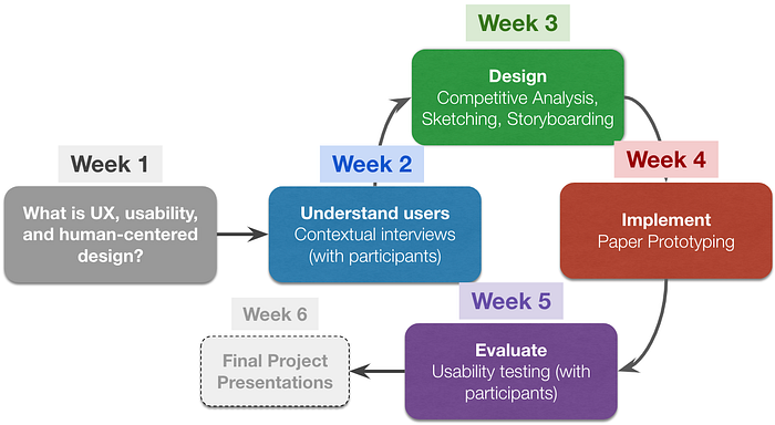
For our summer course, we held class every weekday for 6 weeks. We aimed to fill each day with about 2–3 hours of work (including lectures, exercises, assignments, etc). After some affinity diagramming, we planned to teach the HCD process over six weeks as follows:

Content focused on UX research methods, rather than programming prototypes or an in-depth focus on wire-framing tools like Sketch. As a result, the course does not require prior knowledge of programming, electronics or design, and students come from a variety of majors — for example, Information Science, Communication, Architecture, Engineering, Computer Science, and Industrial Labor Relations. This translates to a diversity of project ideas and prior knowledge.
After adapting the core course, we went to task collecting recent research at the intersection of UX, human-centered design (HCD), and AI. We reviewed an array of resources on UX-AI, particularly the Google PAIR Guidebook, work from Microsoft Research, Qian Yang’s research, and syllabi from other universities. Having spread the HCD process over six weeks, we proceeded to question where AI concepts could fit. This led to five major decisions for integrating an AI perspective into an intro UX course, which we now cover in turn.
1. Delay the introduction of AI concepts.
Our central challenge was how to introduce AI in a class where the vast majority of students have no prior knowledge of UX design methods. Nearly all novices struggle with putting users first — stopping themselves from starting with the tech and assuming they know what users want. If there’s one learning outcome they should take away from an intro UX course, it’s how to avoid tech-centric design. Introducing AI too early risks dominating that conversation, putting technology first, or confusing students. We wanted to keep the focus squarely on human-centered design and UX, and to suggest ways in which AI fits into those methods and processes.
Thus we decided not to discuss much about AI until the 3rd week of class, when we passed the “Understanding Users” phase and entered Ideation & Design stage. However, we also sought to illustrate the relevance of UX/HCI methods to the changing landscape of AI technology.
For instance, we illustrated the four-stage HCD process with Beede et al.’s CHI 2020 paper on a deep learning system for health clinics in Thailand, and introduced remote “contextual” interviews and “data elicitation” with an interview protocol around semi-autonomous vehicles. (To get around constraints of remote interviewing, data elicitation is a method where interviewers ask participants to prepare some data, like photos or videos, and bring them to the interview.) We also asked students to choose products or systems that they thought counted as “AI” and explain why, which revealed a diversity of students’ own conceptions of what constitutes artificial intelligence. Many students came up with the usual suspects — voice assistants, autonomous cars, autocomplete — but others came up with more interesting/questionable answers:
- Tamagotchi, since it can “evolve” and “mimics the cognitive functions of the human mind” and emotions
- Calculator, since it “is a substitute for the human thinking process”
- Car repair manual, since “it enhances the human intellect, giving us the knowledge to fix our vehicles without having to figure it out ourselves.”
Some of these answers seem “wrong,” but AI is notoriously hard to define. Instead of telling them first, we preferred to have students explore what AI means to them, which helped us adjust our teaching strategy later on.
2. Introduce AI just before Ideation & Design.
We began the third week, “Ideation and Design,” by defining AI (largely through the lens of ML) and establishing how it differs from more “traditional” design materials. We spent two whole days on AI topics.

From the start, we went in-depth to provide exemplar variants of ML, following conventional distinctions among tasks like classification, regression, control, and representation learning, as well as supervised, unsupervised, and reinforcement approaches to learning. The goal of this section was to spur students’ imaginations with tons of examples, before they ideated designs based on contextual interviews. Putting AI right before ideation helps overcome a common pitfall, where designers don’t even consider AI or skate over it during their prototyping processes.
That said, we wanted the benefits of a matchmaking-like process without the solution-centrism of matchmaking. Matchmaking is a process proposed by Bly & Churchill in 1999 (later extended by van Dijk & Zimmerman in the context of AI tech) described as “technology in search of users.” This runs counter to a human-centered, discovery-driven design process. We sought to invert the process, to emphasize “users in search of a technology” by suggesting many types of AI “materials” students could draw from during their design ideation.
3. Provide a way to classify AI tech by complexity.
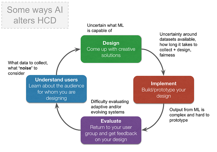
After introducing definitions and examples, we used Yang et al.’s taxonomy of AI to establish four “levels” of AI systems and scope how AI alters the HCD process. From Yang et al.’s paper, we mapped out ways that AI intersects with our four stages:

Classifying an AI system/element allows designers to anticipate what they will have trouble with and how to prototype, address, and mitigate those challenges. Yang et al. separate the banner of “AI” into four broad Levels or types of systems, characterized by their “capability uncertainty” and “output complexity.” For example, a binary classifier is a Level 1 system, since the capabilities and outputs of the system are well-defined (regardless of how complex the underlying algorithm is). Level 4 systems, by contrast, includes tech like an autonomous Twitter bot which holds conversations with users and whose model evolves over time.
To make the taxonomy concrete, we asked students to find and map AI systems to each level, and justify their mapping. Although we could have trouble classifying a system ourselves, we found that the process of negotiating the boundaries of the taxonomy’s Levels was productive. The dialectic challenged students to situate how “complex” an AI system was from the perspective of a UX designer rather than a ML engineer. This led to interesting conversations with students, such as what made a probabilistic system different from other input/output mappings like a calculator or a Google form. For instance, one student classified a Light Clapper as a Level 1 system:
“The system provides a way to turn the lights on and off without touch. The user input is a clap, and the output is the system turning the lights on or off. Training data would be audio of claps and other types of audio… This system is level one because it has a very simple output and doesn’t modify itself. Its computation is detecting whether a sound is a triggering clap, and its only output is flipping the binary state of whether the lights are on.”
Another student characterized a Mario game-playing AI as an “evolving” Level 3 system:
“…because the number of outputs are finite and unchanging, because the program is restricted to using the game controls (low output complexity). But the model evolves as the inputs — which are all of the games’ visuals and audio — change per level. This AI demonstrates high capability uncertainty because the way it chooses to approach higher levels of game play is surprising; instead of just improving its capability, it evolves outside of our expectations.”
And a third classified TikTok’s “For You Page” as a Level 4 system:
“It has high capability uncertainty because users don’t exactly know how or the extent to which the system knows what they want to see. Some users don’t even realize that their FYP is specifically catered to them. It is highly adaptable to user inputs, as millions of users are constantly interacting with content. A person’s interests may change over time, and the system adapts to those changes.”
The taxonomy also helped scope our discussion of UX techniques in relation to AI elements. In other words, when speaking of lenses like user control and feedback, mental models and engendering trust, we could situate what types of AI tech these lenses apply to and how they manifest at particular levels. For example, precision/recall trade-offs are clearer for Level 1 systems, which include classifiers with simple outputs, while Wizard of Oz techniques are more important for Level 2 systems. After deploying Yang et al.’s taxonomy in practice, we highly recommend it as a pedagogical tool.
4. Simplify AI perspectives (a.k.a. Three Lenses for Designing for AI).
There’s tons of ideas on how AI changes UX design processes. Yet often guidelines come with poor UX themselves, filling whole pages with laundry lists that are too specific to be actionable across a broad range of projects. Google PAIR has already done a great job of distilling lenses, but we needed even more condensation, since our students start out not even knowing what UX is.
We reviewed guidelines across an array of resources to synthesized three simple, catchy “commands” for our UX-AI trailblazers:
- Anticipate failure modes
- Calibrate user expectations and trust
- Elaborate means of feedback and control
Anticipate, calibrate, elaborate are easy to remember compared to the often multifaceted lenses proposed in other work, and we believe they sum up many scenarios nicely. The first, failure modes, hammered home a key difference between ML and deterministic software: unavoidable breakdowns and the need to think about false positives, negatives, confusion matrices, etc. The second focuses on establishing/building trust with users and not setting up the wrong expectations, while the third reminds designers to give, and provide ways of giving, feedback and user control. We again used Beede et al.’s CHI 2020 paper — which focused on a Google Health deep learning system to detect diabetic retinopathy — to ground our introduction to these three lenses.

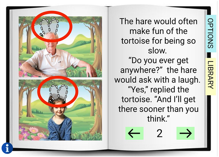
It was exciting to see how students applied these lenses in their final designs. One team designed an app for grandparents to read stories to their grandchildren remotely and interact through fun, augmented video feeds. Saying key words can trigger events in the video overlay, such as filters, background changes, or prompts. They explained how they incorporated lenses of “calibrating expectations” for the overall app and “elaborating feedback and control” for designing a doodling feature:

“We included minimalistic onboarding tutorials that are available at any time. From our interviews, we expected our target demographic of senior citizens to be less tech literate. The small blue icon on the lower left corner of every page gives the user simple to read and understand directions about the specific functionalities of that particular page. […]
We also added the dotted lines prompt with the pencil insignia next to it to prompt the users that they should draw something on the feed in the shape of the suggested icon in order to interact with the doodle overlay. In the end, however, the user has the ultimate control whether they want to draw or not and what they want to draw. The AI simply tries to guide the user into what they can and cannot control and doodle on in this example.”
Another team designed an app that recommends paths for walking safely at night. In addition to suggesting the most well-lit, public path, it included a voice assistant that chat with you while you walked — i.e., so that you can appear “on the phone” or busy to onlookers. The AI asked reflective questions to distract or calm users down, and included commands you could say if you were in danger, such as contacting the police or alerting emergency contacts. For “anticipating failure,” the team stressed the importance of minimizing false negatives “to maintain the conversation with the user” since in this context, it’s more important that users do not feel abandoned. The team also mocked up a flowchart for how the assistant would handle un-parseable commands or continuing after an emergency command is executed. For elaborating control, the team also included these emergency commands as buttons over multiple screens, with big, simple buttons at the request of users.
5. Explore the complexity of AI with Wizard of Oz.
Some students can be overwhelmed by the mention of AI. Yet others can assume AI technology will solve all of their design problems. These latter students make lo-fi prototypes that skate over real-world complexity and the propensity for UX-breaking errors. In order to challenge that orientation, students need some hands-on experience thinking from the perspective of an AI element.
To match this challenge without entering programming territory, we used the Prototype Evaluation stage of HCD to explore Wizard of Oz techniques for AI systems. Students were tasked with designing and testing a WoZ protocol for a Voice Assistant they had prototyped, mapping out the wizard’s behavior, defining constraints, and simulating realistic errors. They later simulated errors for the AI elements in their group projects. While not all AI elements are made equal, we believe the process of designing a WoZ protocol served as a good pedagogical tool for teams to flesh out their prototypes and question shaky assumptions.
In our discussion of WoZ, we suggested how the technique could probe design questions around anticipating failure modes, calibrating user expectations, and elaborating means of feedback and control. In particular, we discussed Mok et al.’s WoZ study on robotic drawers, which found an interaction between social behaviors and user perceptions of control in a collaboration with a robot. We also outlined the importance and difficulty of simulating AI limitations in a realistic way, drawing on Yang et al.’s CHI 2019 paper, Sketching NLP, using their example of leveraging a translation service to simulate realistic context-extraction errors as an inspiring example. Finally, we discussed ethical considerations when using deception in WoZ, the potential psychological impacts for the wizard, and the opportunity WoZ offers designers to gain empathy with those who might use their designs.
Conclusion
Overall, we found that integrating AI concepts into an intro UX course was possible, worthwhile, and often a lot of fun. However, we also needed some extra time to integrate AI concepts in a way that does not dilute them. Were we not faced with the challenges of remote learning and the compressed nature of a summer course, we believe a more spread-out course can naturally integrate AI considerations into lessons, even for beginners to UX.
Despite this potential, we stress that future educators should be careful to set the right expectations. Instead of centering AI in syllabi and letting it dominate the discussion, we believe that integrating AI lenses into core UX courses should be done more silently. While AI tech poses some unique challenges to UX, more often than not it merely augments existing UX methods and practices, rather than displacing them. We also don’t yet know all the answers — UX-AI is an active research area, after all! — and so instructors need to be honest with that uncertainty. Calibrating the right expectations is, like good UX, also good pedagogy.
Some of our Resources
- AI From 30,000 Feet (SLIDES): Our intro lecture to AI, ML, and how AI changes the human-centered design process.
- Simple intro exercise on false positives/negatives and thresholds in the context of designing for people and society
Bios
Ian Arawjo is a PhD candidate at Cornell University in Information Science. He studies the intersection of programming and culture. His dissertation work explores how to design CS education as a site for intercultural learning and relationship building across difference.
Matthew Law is a PhD candidate at Cornell University in Information Science. He studies human-robot interaction (HRI), specifically how humans and robots can collaboratively design.
Mahima Rao is a Research Intern at Cornell University, studying under Dr. Qian Yang. Her work focuses on UX-AI convergence. She earned her Masters in Information Science in Spring 2020.